26 May 2026
IdroGEO receives the Honorable Mention at the XXIX edition of the Compasso d'Oro ADI
1. Introduction: the award as an indicator
I personally have some reservations about awards, rooted in a certain underlying skepticism about whether a single recognition can truly capture the full weight of a design project. At the same time, I acknowledge that for many, it represents a significant milestone in terms of reputation and marketing positioning.
The question I have always asked myself is: is there really anyone capable of determining what deserves such a meaningful recognition?
In the case of the Compasso d'Oro, however, the conversation becomes more interesting: entering the permanent collection of ADI, the institution that symbolizes Italian design in Europe and around the world, is an achievement of undeniable specific gravity. For this reason, for us it represents an indicator of excellent design health, a source of pride that fits into a broader reflection rather than a simple opposition between skepticism and endorsement.
This recognition, received on Friday, May 22, 2026 in Milan at the ADI Design Museum, fills us with pride. We experience it as an important confirmation of the design quality we bring to each and every project. Finding the right balance between aesthetics, functionality, technology, and technical requirements is almost never straightforward, and that is precisely why continuous dialogue and sharing within the team become our natural way of working. We worked tirelessly to keep functionality, performance, and aesthetics together, including through ongoing conversation with the development team, in search of User Experience solutions that were truly sustainable from a technical standpoint. Along this journey, that dialogue proved invaluable.
2. The research: finding the right combination
This recognition holds particular importance because it was awarded to a project that embodies the DNA of our method.
In the type of consultancy we practice, research always comes first. In this case, we combined, naturally and organically, the usability component (UX) with the more visual dimension of building an interface (UI) designed for data visualization, which plays a fundamental role in the IdroGEO platform.
3. Method: the interplay of expertise as a driver of research
This project is the connection point between SciamLab and Studio Brillante, the very first collaboration that brought us together: technology and design, two domains that are core to who we are, and that in IdroGEO converge. Together, we faced the challenge of managing a large volume of complex data, geospatial, parametric, dynamic, while ensuring high performance even on mobile devices and under variable connectivity conditions, and at the same time shaping a usable and intuitive interface.
The balance between performance and usability was one of our central goals from the very beginning: making processing speed and clarity of experience two sides of the same coin, without sacrificing either. The result is a product that allows thousands of users to access the service from any device, especially on the go, while doing justice to the complexity of the content.
4. Design Goal: usability in service of citizens
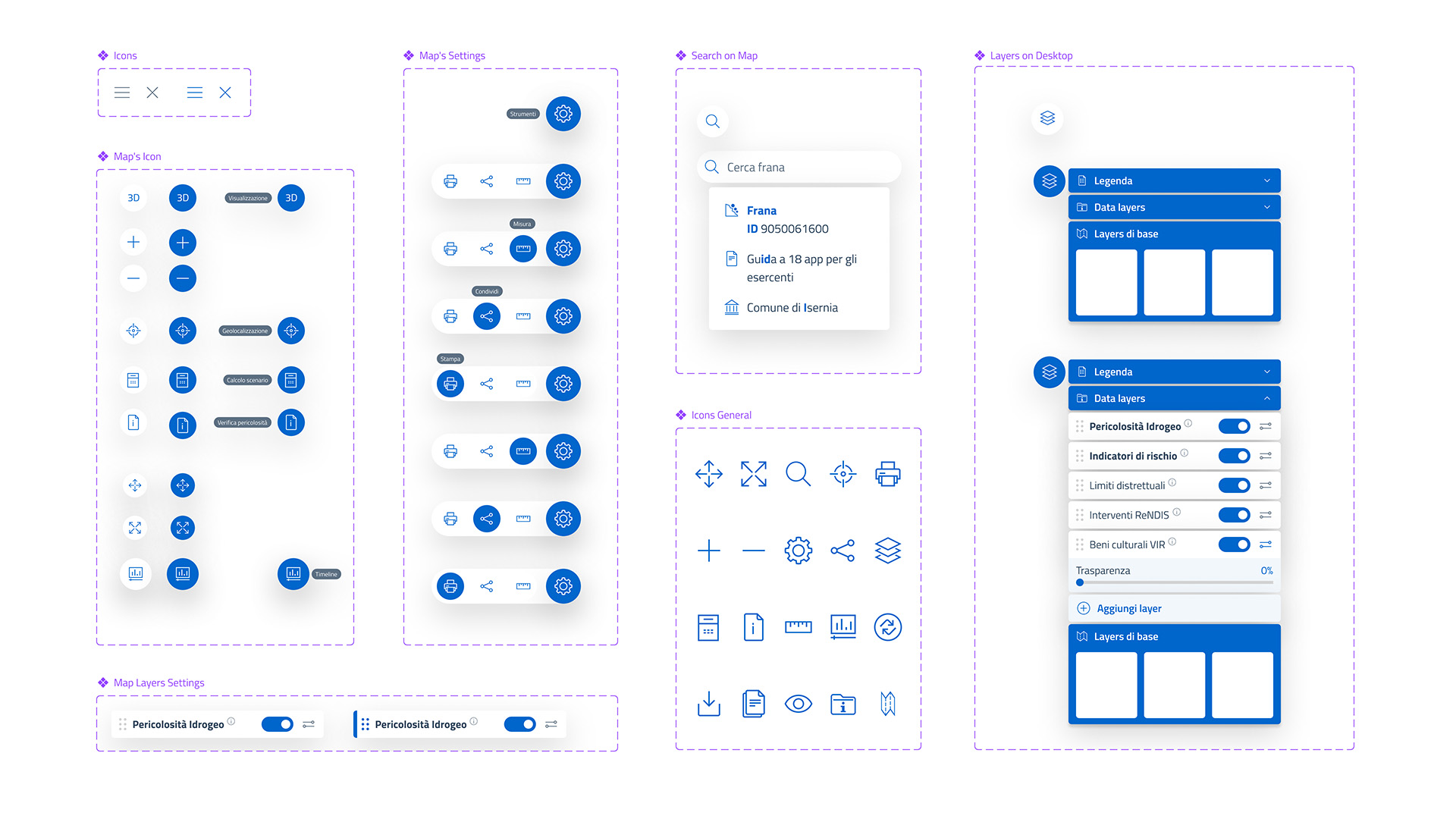
One of the project's several objectives was always clearly defined: to maximize usability by bringing order to complex data and making it accessible to a broad audience. We used design as a tool to simplify navigation flows and make browsing clear, linear, and accessible from smartphones (mobile-first approach).
The starting point was a process structured around the ISO 9241-210 standard on "Human-centred design for interactive systems," articulated in four phases: context of use specification, user requirements analysis, identification of design solutions, and platform evaluation. The user categories we considered and in part worked with are very diverse: public decision-makers, territorial planners, geologists, railway and road network management companies, professionals, representatives of financial and insurance institutions, and citizens. Each approaches the platform with different questions, levels of expertise, and often different devices. Holding this plurality together meant defining very clear requirements: ease of use, accessibility from smartphones, tablets, and desktops, clarity and completeness of information, social sharing, generation of detailed reports, and data download.
The main challenge, from a design perspective, was the one typical of WebGIS platforms (geospatial platforms for the web) aimed at a broad audience: bringing together three informational dimensions that speak different languages. On one side, the map, the visual heart of the platform conveying territorial data; on the other, abundant textual and descriptive content needed to contextualize that data; finally, structured data presented as tables and charts, which convey the statistical and quantitative dimension. Making these three planes coexist in a single interface, in balance with one another, was a constant exercise.
One of the design choices we are most satisfied with concerns the dynamic information panel: hovering over the map on desktop, or tapping on a smartphone, the user sees real-time updates of aggregated data at the national, regional, provincial, or municipal level depending on the current zoom level. Information is delivered through dynamic infographics, a solution that, compared to similar cartographic applications, gives content greater immediacy and significant communicative impact.
The mobile-first approach guided us in setting the portrait mobile version as the default resolution, treating tablet and desktop as subsequent options, and in rethinking the relationship between map and content by adopting solutions such as collapsible sliding panels that overlay the map using a drill-down logic, borrowed from business intelligence tools.
Another crucial aspect was the work on data comprehensibility. IdroGEO exposes technical information (landslide and flood hazard perimeters, risk classes, indicators) traditionally used mainly by domain experts. At the same time, the IFFI inventory management area allows online editing of point, line, and polygon geometries, and the collection of hundreds of attributes within the landslide record, organized into 19 information categories: a complexity we addressed by designing an interface capable of serving both the citizen looking for a summary and the technician entering detailed information. We reasoned carefully about labels, legends, color codes, and the progressive disclosure of information, so that anyone seeking an immediate answer finds it right away, while those who want to go deeper can do so through successive layers of reading.
5. User Interface: the Designers Italia guidelines (UI Kit Italia)
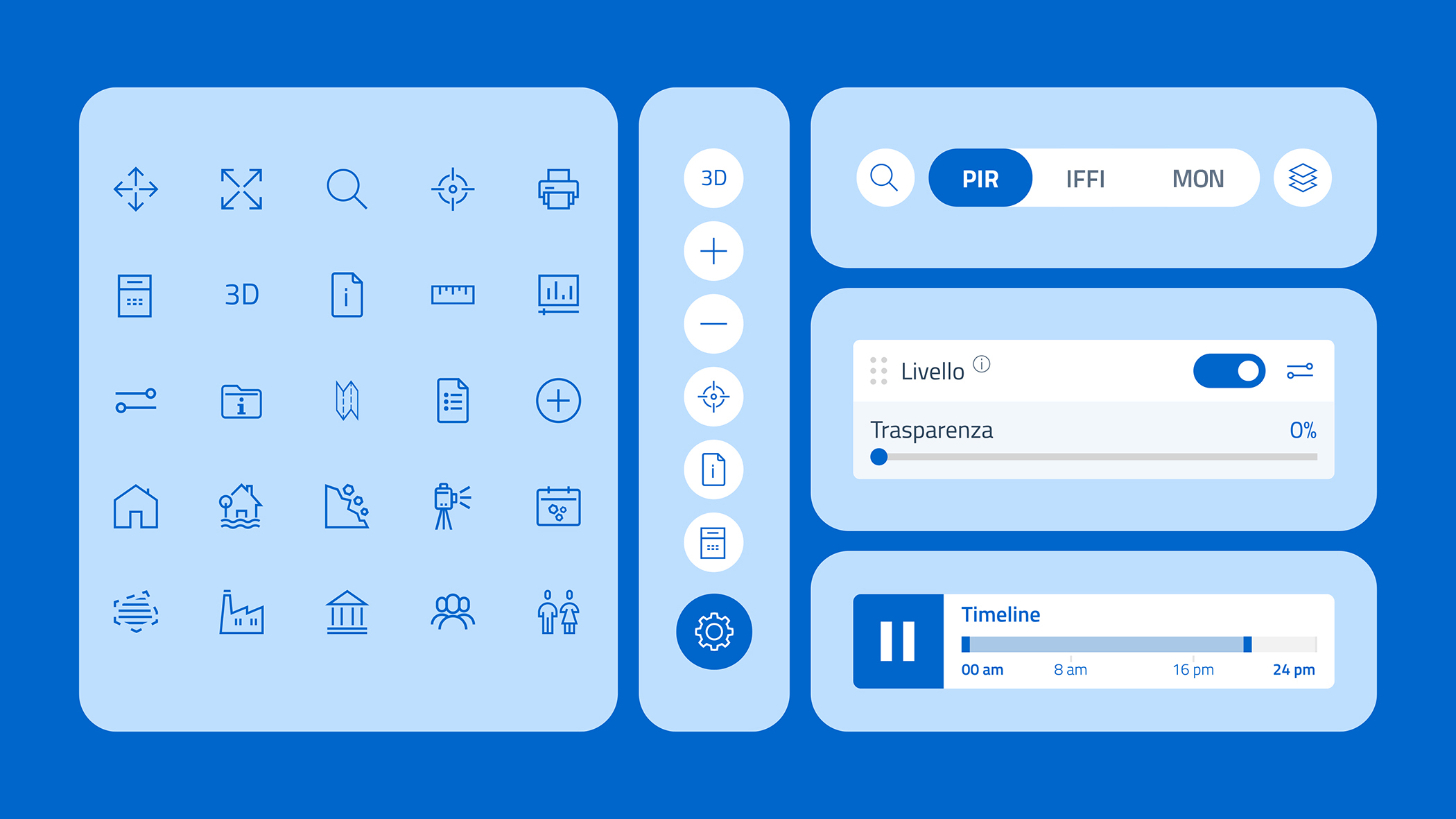
There is one person we want to thank in particular, because she was instrumental in this project: Sara Andreozzi, UX/UI Designer currently pursuing a PhD in Design for Social Change, who accompanied us from the very beginning in creating the design, applying and interpreting perfectly the guidelines developed by the Department for Digital Transformation and AGID through the "UI Kit Italia."
This work required a significant dose of analysis and commitment, which then manifested in the creation of custom components and widgets, built to meet the specific needs of map navigation while remaining closely aligned with the accessibility principles that the AGID guidelines place front and center. On the technical side, the interface was developed using the Angular framework and Bootstrap Italia, the UI framework of the Digital Transformation Team, which we extended to integrate the OpenLayers and Cesium libraries to manage the highly customized 2D and 3D cartographic components the platform required.
6. The client: the importance of awareness
I have always been a proponent of a very simple thesis: to create a good project, you need the right client, the right preparation, and a healthy dose of vision. Given these premises, a project can give rise to something new, experimental, worth building. In this case, working alongside the ISPRA team, in particular Alessandro Trigila and Carla Iadanza, our references and an inexhaustible driving force, meant immersing ourselves in specific areas of knowledge, such as geology, that enriched us greatly in terms of understanding.
7. Conclusion: a project in continuous evolution
As is the best tradition in consultancy, we have now established a long-running ongoing collaboration with ISPRA, particularly for the updating and maintenance of IdroGEO, a platform that adapts and evolves in step with technological progress.
From the first release, we have now reached IdroGEO 2.0, a version that integrates 3D geospatial visualizations, risk scenario simulations, advanced layer management, and access to sensor data from the Landslide Monitoring Network, alongside the integration of AI agents for the immediate retrieval of information from scientific and regulatory texts, and conversational assistants that expose the platform's functions and data in a simple, immediate way.
An evolution made possible by an open architecture, built around a solid API, designed from the outset to be interoperable, scalable, and reusable, because a digital public service of this scope lives only if it can grow and serve more users over time.
For us, this is a starting point and a confirmation to keep working and investing in projects that, like this one, manage to bring real value to our expertise and to that of our clients.
Read the Case Study: IdroGEO